
Are you thinking about selling your work? Want to sell it without looking cheesy or desperate? Afterall, you take your art seriously. You don’t want to feel icky when it comes to selling it.
Part of the process of selling your work is to clearly communicate the price of your work and in a way that feels good to you. In the Should You Show Prices On Your Art Website? article, I share reasons for putting your prices on your website and how helpful it can be to a buyer.
If you’re considering adding your prices to your website, figuring out how to do it in a way that looks good can lead to a lot of questions. Starting with, how do I show prices without looking cheesy?
To help with this, I’m sharing a few strategies you can use to help show your art prices on your website in a way that’s professional and looks good, too.
Emphasize the Art
Show a beautiful image of the work. Make the art take up more visual space on your website than the price or text describing it takes up.
De-emphasize the Price
The cost or purchase button doesn’t need to overpower the image. If you feel like the price looks too stark, large or loud, there are a few graphic design tricks that you can employ to help downplay the price.
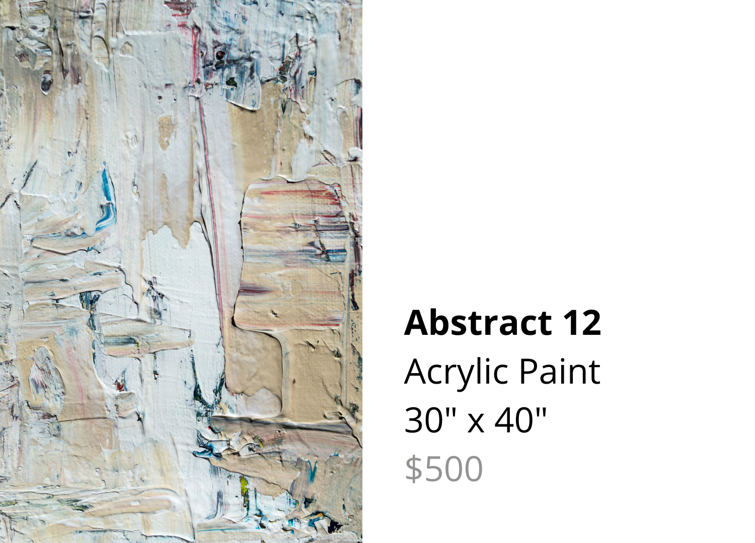
Make the price an 80% gray color. This is an old graphic designer’s trick where you make a piece of text that's black and dial down the intensity of the color to be about 80% less black which is a dark-ish but still readable gray. Below is an example of how that looks. See how much lighter and de-emphasized the price looks?
Put prices in a smaller font size. Even two font sizes smaller will usually do the trick.
Link the text to purchase instead of using a button. This isn’t exactly about how to show the price but it is part of setting it up so it looks the way you want. If you don’t like the way buttons look, or you don’t want to set up an official shop, you can link text to direct people to contact you to purchase.
Direct people to your gallery. If you have an agreement or a current exhibition with a gallery, talk to the gallery to see if they’re okay with you showing the work on your website. If they are, let viewers know exactly how they can contact the gallery for purchase.
Click on the examples of these four strategies below to see them in better detail.


Change the text of the purchase button. Your template’s button may say, “BUY NOW!” but there are usually ways to edit what the buttons say. Google it and find out how to change it in your software to something softer like, “Add to Cart”, “Purchase” or “Take Me Home”. Bonus points if it’s not in all caps.
Change the color of the purchase button. If your website template requires a button, you may be able to change the color to downplay it. Going from a red button to a black, 80% gray or more neutral colored button will make it much less loud.
Show thumbnail images and purchase options after clicking on the image. Maybe you have a shop or gallery of your available works where your prices show only when someone clicks on a thumbnail to learn more. That way the price isn’t so up front.
In all of these appraoches, notice what is more clear and easy to read. Notice what is emphasized or de-emphasized. The goal is to make your art shine. And when it resonates with your viewer, they have what they need when they decide to purchase it.
As an artist, you’ve got opinions about how something should look. And these aesthetic opinions extend to how your prices are shown, too. Take a look at these examples and find other examples that you like. Then make adjustments to how you show prices for your art on your website.
Let me know if you find any of these strategies helpful when it comes to showing your prices on your website in the comments. I’d love to hear your thoughts about it!
Cheers,
Kate